Using Color to Capture Attention

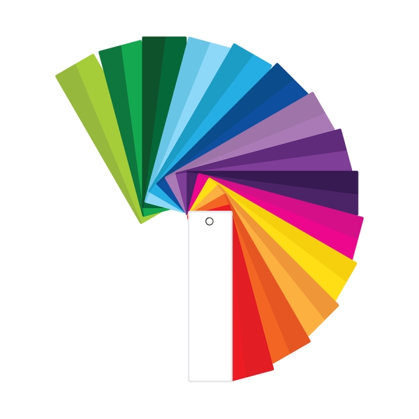
A lot goes into creating an effective sign, but color use is the key to capturing customers’ attention. Different colors bring out different emotions, so you have to think about which feelings will draw people to your business. If you want people to feel excited, colors like red and yellow are usually good choices, but if you want them to see your company as a calm and peaceful place, colors like blue and green can give that message.
It’s also important to consider the brightness and intensity of colors that you choose. Bolder colors will be more noticeable than muted tones, even within the same color family. For example, electric blue will stand out a lot more than baby blue, but will also convey a different message. Regardless of color, always be sure to have significant contrast between the foreground and background of a sign. The higher the contrast, the easier your sign will be to see and read.
Contact Olympic Signs to learn more about designing effective signage. Our experts in Chicago can help with every step of your sign project from planning to creation. You can get started online or call us at 630-424-6100.
