Designing an Eye-Catching Pylon Sign
Outdoor signs play an important role in directing people to your business, helping customers spot your location, and describing your services. For this type of advertising, many people choose pylon signs to showcase their business location. Read on for tips on how to design an eye-catching pylon sign.
Keep It Simple
When designing a commercial sign for the first time, many people try to pack too much information into the space. While doing so can make your sign informative, it can also cause it to be confusing and less dramatic. For this reason, the message of your sign should be short and easy to understand. Some people choose to put only their business’ logo, while others add a few descriptive words regarding their services. Including more than this can detract from your sign’s visibility.
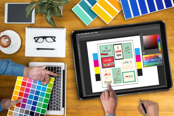
Include Bright Colors
When it comes to visibility, color and contrast are essential. One mistake to avoid when designing your pylon sign is using colors that are too similar. While you may like a soft, elegant look that includes similar colors from your business logo’s color palette, this is not an ideal approach to making an eye-catching pylon sign. Instead, incorporate no more than a few of these colors into the logo or business name and then place these against a contrasting backdrop. If you prefer a monochromatic look, then contrast becomes even more important, so your sign should consist mostly of black and white, rather than gray.
Stay on Point
Finally, the font and logo size that you choose to play an important role in making your pylon sign visible. Your business’ name or logo should be large, bold, and occupy most of the sign’s area. Any additional pictures or wording should be small. Remember, less is more when it comes to making an eye-catching sign, so avoid adding much more to the design than the business name or logo.
Olympic Signs specializes in designing and fabricating pylon signs and other types of outdoor signs in Chicago, IL. To learn more about our sign company services, please give us a call today at 630-424-6100.